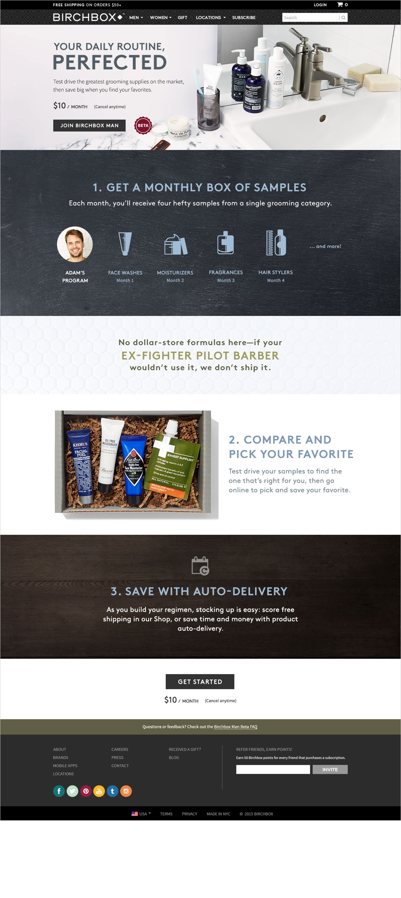
Birchbox Man
web UX / UI
Birchbox is the pioneering subscription beauty / grooming box. With a strong women's subscription and online shop, the company found its men's business lacking in comparison. Thus, they set out to overhaul the men's subscription grooming product with a beta test.
Responsibilities
As a freelance product designer brought on for the Beta test, I worked closely with product and business development to translate their extensive research and data into the new men's subscription program they envisioned.
Process
With a close-knit group consisting of a product manager, a copy writer, a content director, and one to two developers, I helped shape the beta test from research to initial ideas, sketches, wireframes, visual designs, prototypes, and final product.
We also conducted research simultaneously, rapidly iterating on designs and features both before and after the launch.
Customer feedback and satisfaction was the cornerstone of the entire experiment, as we tried to create an experience that tapped into the perfect balance of discovery and utility in the way men could ultimately approach grooming.
Components
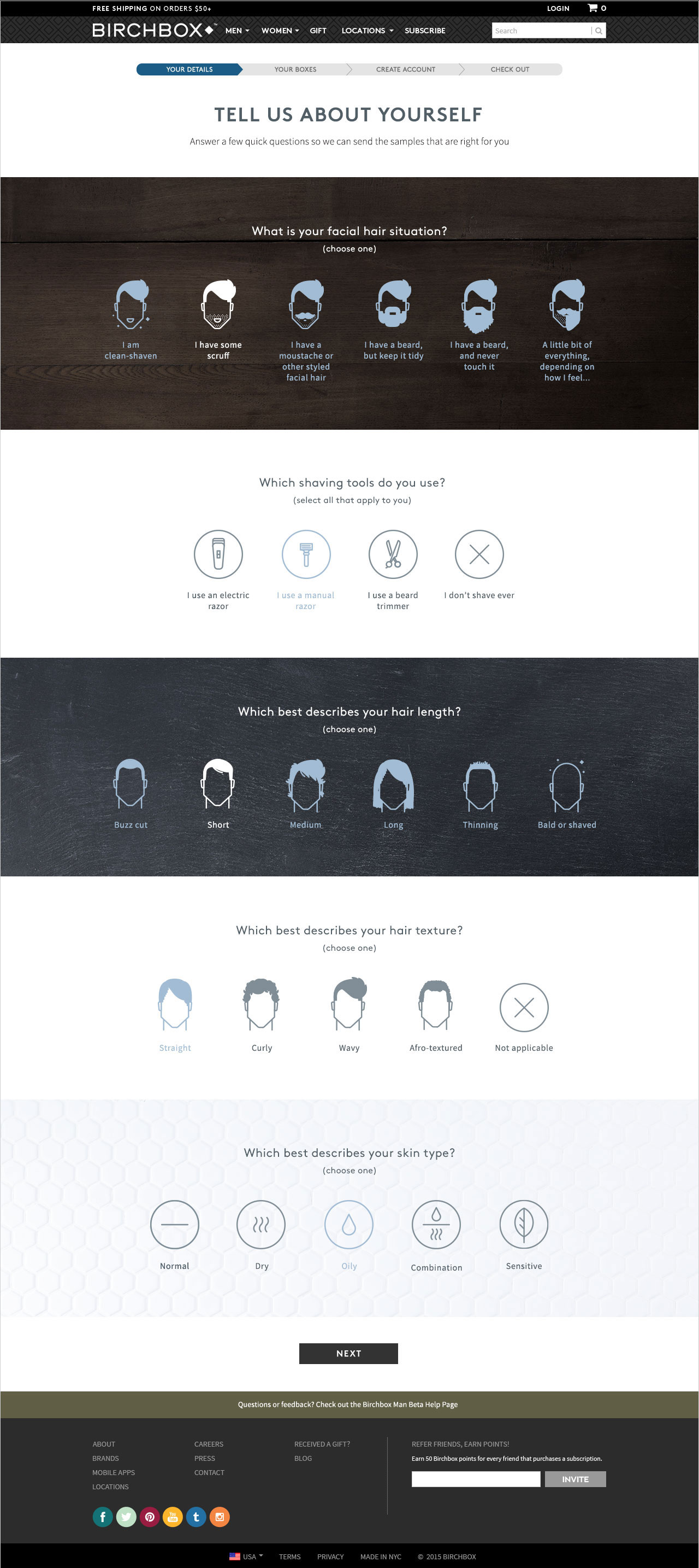
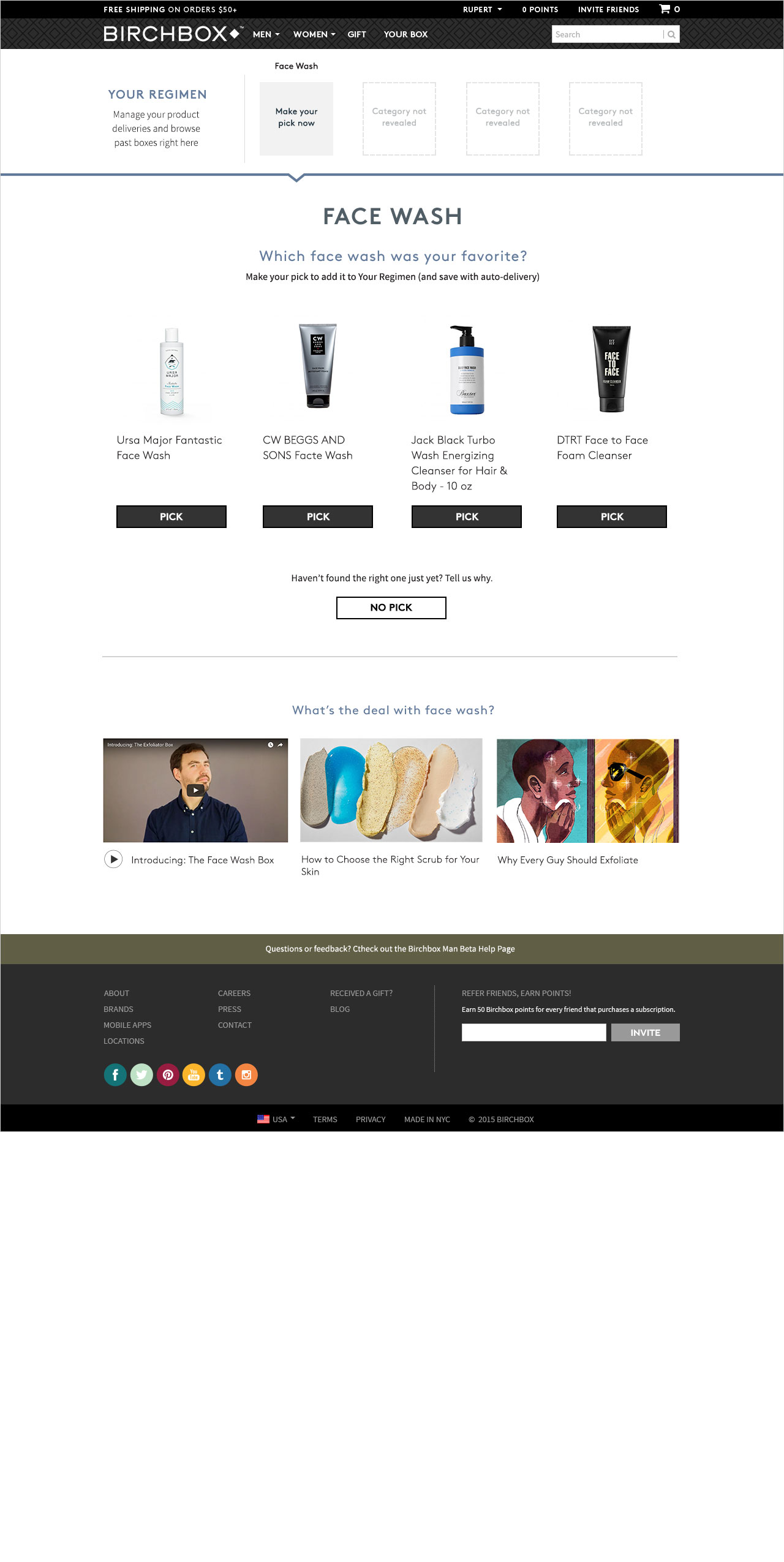
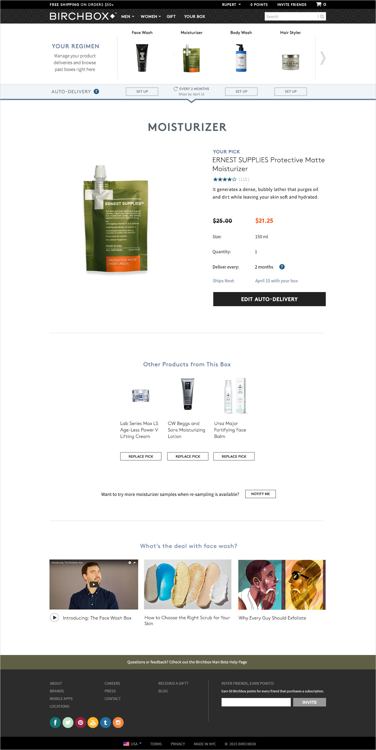
Birchbox Man Beta was launched on desktop and mobile web. The test consisted namely of a join flow and a logged-in dashboard experience, with iterations that expanded upon each section.
Note:
The screens shown here are limited to preserve the integrity of the Beta test. Please contact me to find out more about my process and experience at Birchbox.


