iHeartRadio
mobile UX / UI
iHeartRadio is an internet radio platform with over 50 million registered users, streaming live and custom stations through mobile, web, and home entertainment devices.
Role / Responsibilities
Senior Product Designer for mobile
iOS and Android apps
Manage team of three UX / UI designers and various freelancers
Develop design and production process
Android tablet and mobile home page
iPhone home page
Responsive Design
Creating an app for multiple platforms required scalable UX-thinking, taking into consideration the range of device sizes and resolutions (from older Android phones to 10-inch tablets).
In implementing the same features across iOS and Android devices, my team also strove to maintain the integrity of the device's native platform, while remaining true to the iHeartRadio brand identity.
This often influenced the specific behavior of certain features, such as the home page shown here, which uses cards and grids on Android, and rows on iOS.
All home page content on one screen, at a glance
Focused attention on one home page item at a time
Alternative Designs
UX / UI variations on the home page
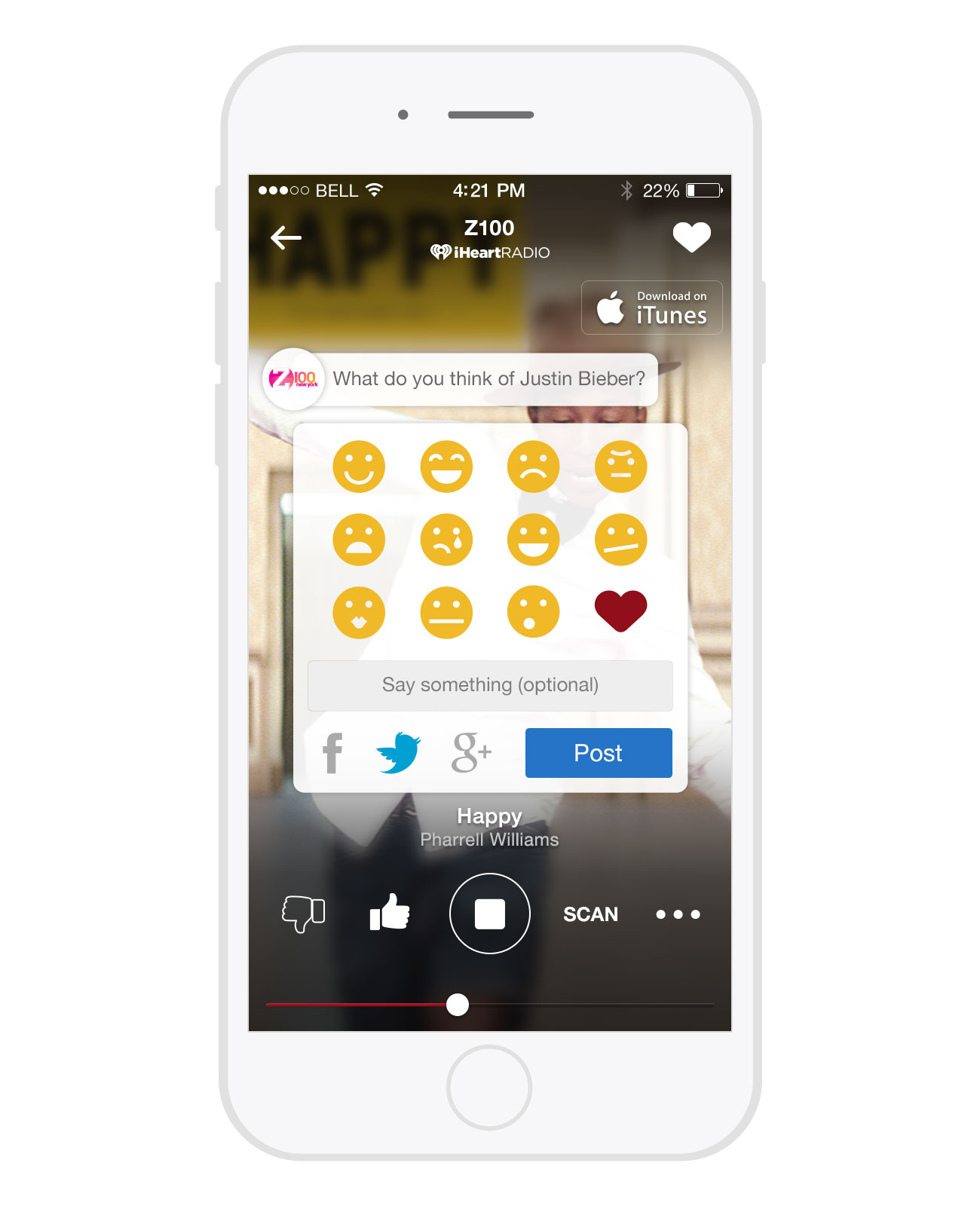
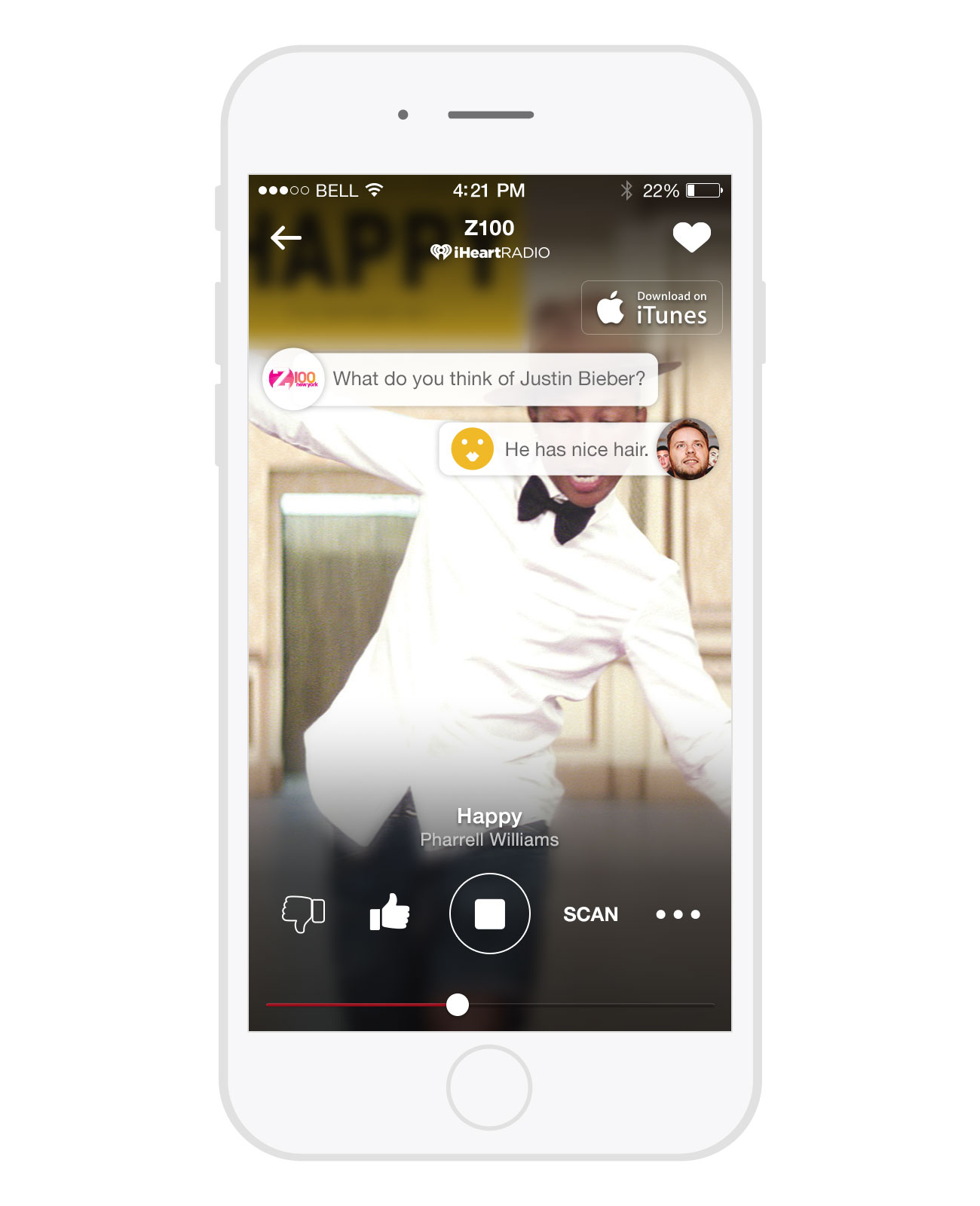
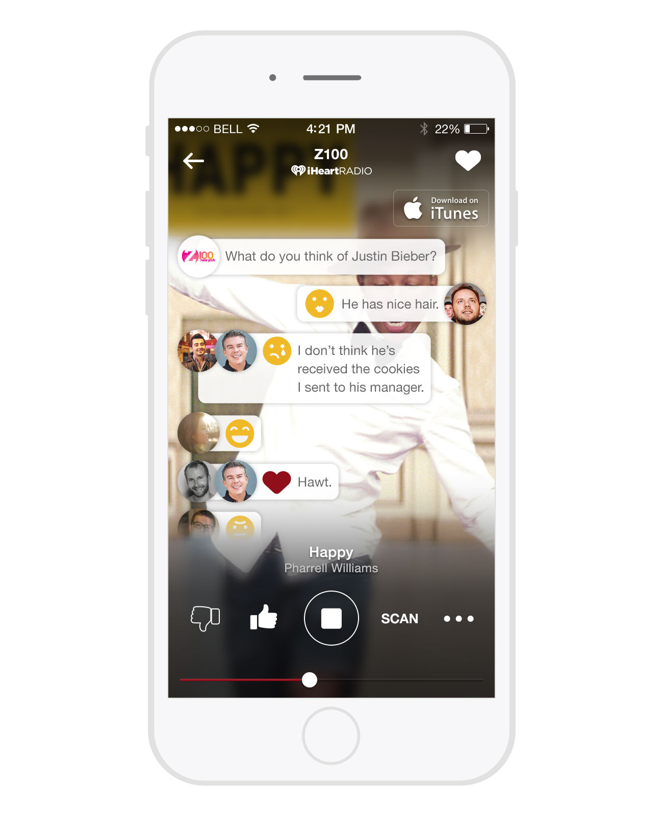
Player and social media integration
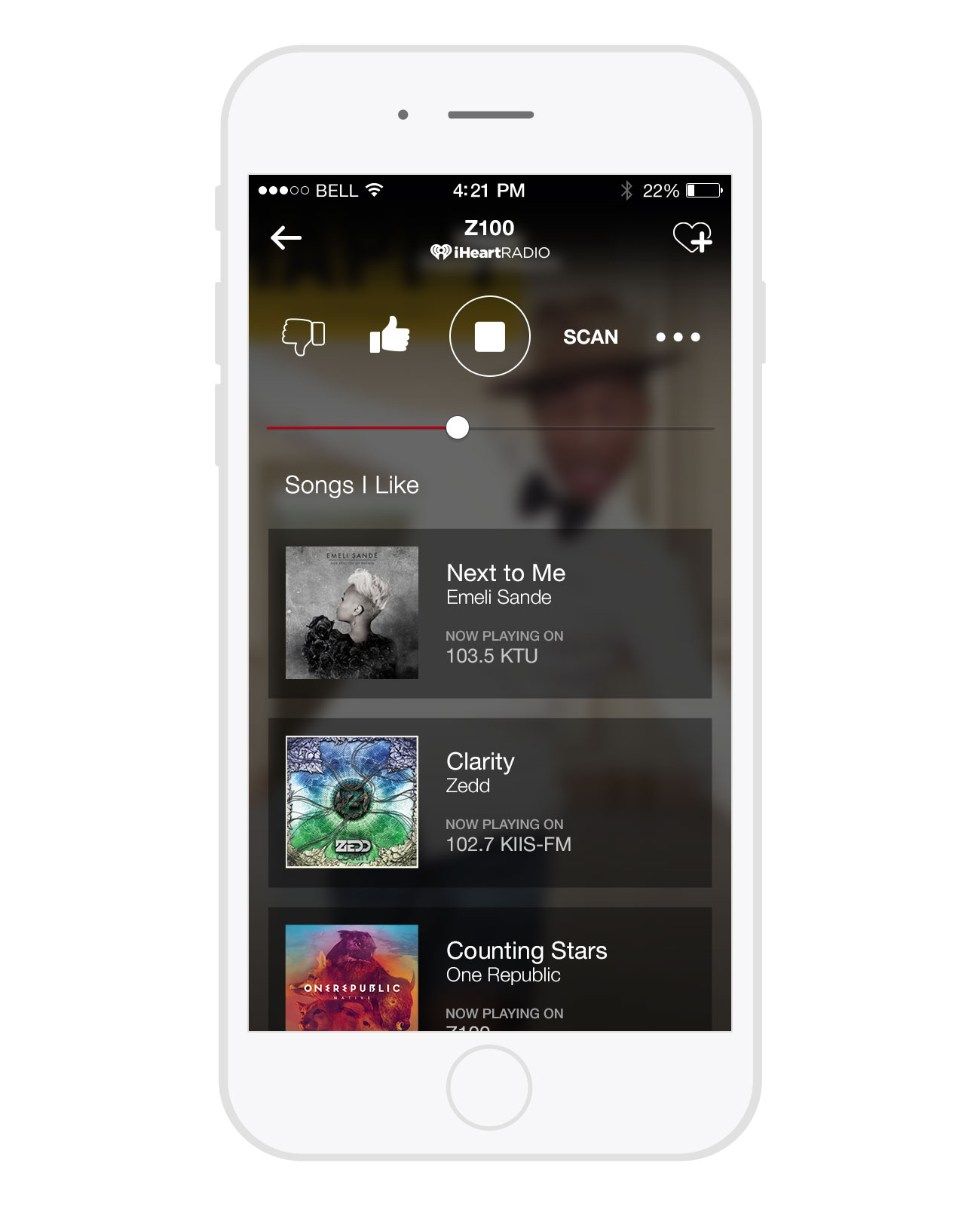
Songs I Like quick access from the player
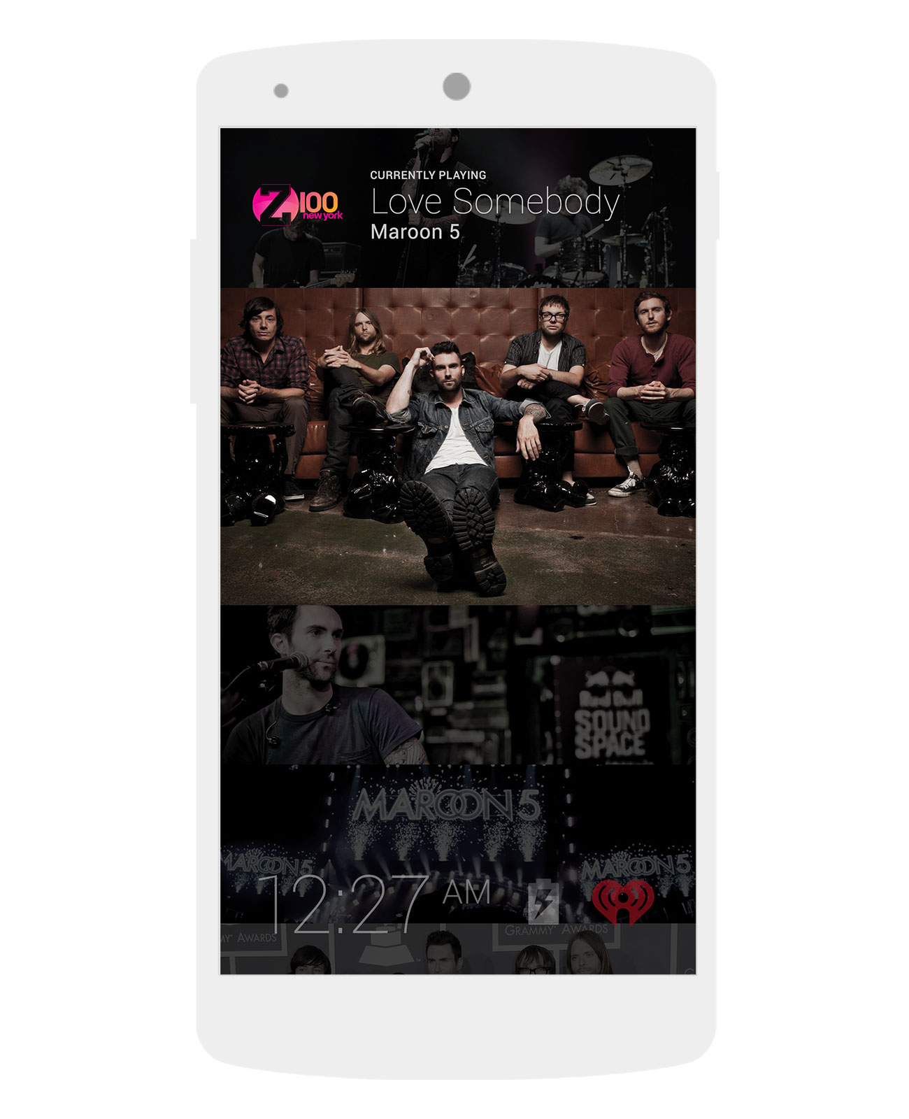
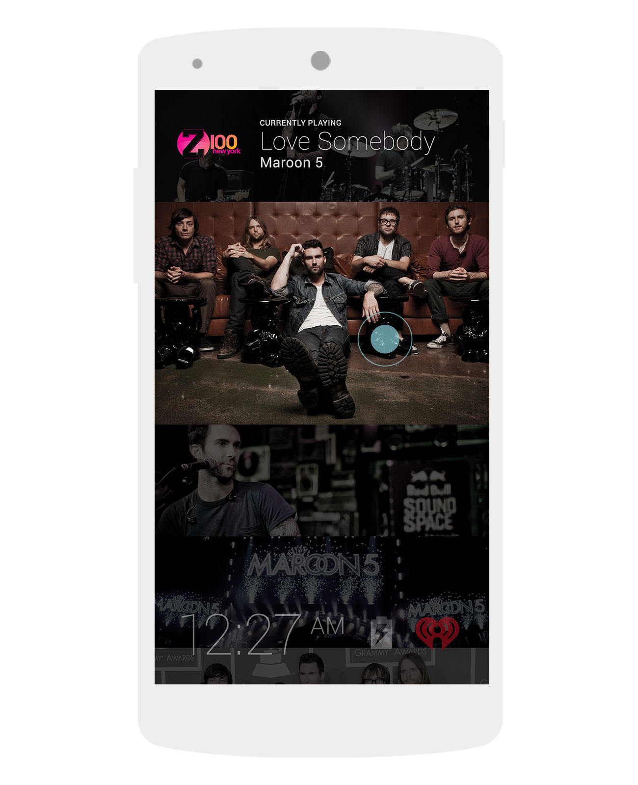
Android Daydream interactive screensaver
Design / Dev Collaboration
One of the best things about working at iHeartRadio was working with incredibly talented developers.
My UX designer and I had the chance to attend a code jam with the dev team, where we worked on building features that both the design and dev team were passionate about. Two days of intense, agile work away from day-to-day business requirements resulted in a hugely successful demo of working prototypes of our collaboration.
Among the features we built were:
Social media interaction integrated into the music player experience
Quick access and suggestions from the player of songs currently playing on other stations
Android Daydream screensaver


